Friday, 21 January 2011

Evaluation Question 4


This video shows many people's feedback towards the music video after the cinema screening. The people's reactions; they felt that the editing was slick and smooth, nice mise on scene, good energy from the artist, good use of props (the boards). One of the comments in the video (Beverly & friend) notes the use of props, the boards and they really enjoyed the little story, also Lauren commented on the motif of the circles that spin round behind the artist. During the cinema screening we got lots of clapping, laughter and excitement. The feedback that we got from people were mainly positive and they seemed to really enjoy the music video. One thing that was highlighted was that some of the shots were in soft focus, which ruined the whole effect of the music video however the mise on scene and the energy from our artist made up for things like that. Mostly people said it was good and entertaining, however a few felt some of the shots were confusing and they didn't get the music video.

This is a comment I got from my target audience, who have experience in media and who listen to this genre.
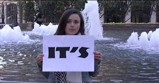
Darrell G: "I felt this video was good, but I had to watch the real one after as it kinda confused me a little. I think the use of the locations were really good, the fountains and that were really nice to look at. I think the guy in the video needs to calm down, I don't know if he's meant to be serious or not but it didn't seem like he was. It seemed like the video was a bit of a joke...I didn't know you liked this genre Tamara...."

Personally, I think that some of the shots could have been filmed better and definitely in more focus, I also felt some of the shots could have been smoother as they look a bit shaky. Also, I felt that the artist was too dominant in the music video and the sub stories weren't made that clear. The audience thought it was more entertaining than anything, I felt that the artist should have been a little more serious rather than how he was.

From all the feedback I learnt that sometimes the the way the artist acts in a music video, effects the way people think about it and which leads them to like a video for the person in it, not necessarily for the edits in the video. Also, to make sure that all footage is clear and when putting the footage together to make the story you are trying to portray is clear and precise. Another thing would be to know more about the genre you are doing, as this creates lots of problems when trying to research ideas for your own products, therefore doing a genre which you know well is more beneficial.

Monday, 17 January 2011

Evaluation - Question 4

4. What have you learned from your audience feedback?


I have learned so many skills during the time my coursework, not just how to make a music video but as well as the idea of marketing and also working with different people.

I learnt a lot about teamwork, this is because at the begining I didnt know a few people in my group but I have managed to put my differences aside and work with them as a team in order to complete a good coursework. I have also learnt how to edit a music video as well as how to lip sync. Furthernore, I found the tutorial of how to use Photohop was very useful as I was able to make my digipak and advert.

Overall, I am very happy with how my music video turned out and have received a great amount of positive feedbacks from it. I am glad that I have chosen to study media at A-Level as I have learnt so many things that includes teamwork and as well as using different software to create a successful coursework.

Evaluation - Question 3

3. How did you use media technologies in the construction and research, planning and evaluation stages


  • In the process of editing, I used Final Cut Pro to edit the video as well as the lip syncing.
  • For the digipak and advert, I used Photoshop
  • Also, blogger itself to post out blogs of keeping up to date what we are doing.


Evaluation - Question 2

2. How effective is the combination of your main product (video) and ancillary texts (digipak and advertisement)

In the process of making my digipak and advert, I have to think carefully about what to put in there so that the audience can see a link with the video.
Firstly, as you can see, my front cover for the digipak is a picture of my artist wearing the same clothes as he wore in the music video and it is also a similar screen shot to a scene in the video. Secondly, for my back cover, I stuck to the theme of time and layout the track listings inside a circle shape that emphasises the clock. Thirdly, for my inside covers, I used the same image of my front cover for my CD image because I wanted to keep it simple by not using too many images.
As for my advert, I decided to do a review of my artist's abum and again I did not want to make things complicated so I used my front cover of my digipak. Furhtermore, as you can see I used the same font to create the release date and simple italic font for the reviews.

evaluation

1. In what ways does your media product use, develop or challenge forms and conventions of real media products?


In my media product, i had a scene of running. This was influenced by the 'running scene' from Rocky. This shot had a great impact as it was a continual sequence going throughout the video, showing the runners reaching the top.

I also was inspired by the official 'Its My Time' video. Throughout the video there is cut away shots of different activities which are reaching the top. There is a scene of judges promoting a dancer and the boxer, these to shots relate back to my music video as I have judges promoting a singer and instead of a boxer I have a gymnist. The official video also has a crowd of people which I have in my music video aswell.


Another influence is from the music video 'Who am I- Nick Jonas.' This gave me the idea of the flipping cards. I used this technique in the video, this made it more attractive as it is something different and it showed different people with different ambitions. It lets the audience interact more and keeps them fascinated due to the flipping cardboards.


2. How effective is the combination of your main product (video) and ancillary texts (digipak and advertisement)?

My digipak links with the video as it has the same colour scheme. It has blue throughout the whole digipak and the atmosphere is night-time. The blue colour coordinates with the costume the singer is wearing. Also, stars and circle are seen during the video and the digipak has the same style.


3.


Evaluation Question 3


We used several different sites for planning and research; we used sites such as youtube and myspace to look up different videos and to find information on our chosen genre and typical type videos. We used Youtube to look at different videos and to compare and get ideas from, this was a good way to see what actual artists of Grime and underground artists do in their videos. This was a great way to get inspiration and to gain more understanding of the codes and conventions of our particular genre. We also looked at music videos from other genres to get ideas and also movie clips, to look at different styles, effects and props we could use in our own video. Facebook was used as a way to advertise our artist, by putting up videos and pictures of the 'behind the scenes' filming of our music video. We also used twitter, as a way to connect with 'fans' by sending out tweets that contained information about the release of the music video and album. Wordle was used as a way to note feedback from people who tweeted and commented on facebook posts and youtube vlogs. Using blogger to show the work that we have created, is a good and effective way to use technology as you are able to use videos, photos and links to illustrate you work, rather than just write up an explanation.


I used photoshop in order to create my digipak rather than Quark Express, as I felt it was much easier to use. In Photoshop CS5, I was able to edit my photos, by using many different tools, below shows a picture being resized once the lasso and magic tool had been used to remove the background.


To edit, we used Final Cut Pro to edit and add effects to our music video, such as dissolves, fades. We used markers in order to match the audio with the video so that the lip sync was right and was matching, we also used markers to mark every beat of the track, so that when cutting and matching up it was much easier to do. We used base track editing for the whole of the music video, which allowed us to have a pop music video' feel to it, as the shots changed with every beat. The razor tool used was most effective, as it helped us to cut our tracks more easily and easy to erase parts, creating more of a 'pop music video' effect.


When it came to filming, we used 1 light kit, tripod for the lighting kit, JVC HD semi professional camera and a still camera. The first time we filmed we didn't have the light kits, which meant most of our shots were pretty dark, meaning we had to film those shots over again. The still camera was used to take the photos for our digipak and in general 'on shoot' photos to post on our blog, to show what we had been doing. 


.
Our group made a digital and animatic storyboard, I then also made an animatic storyboard.
Below is the  digital storyboard that we created as a group, this animatic is the storyboard we created as a group. This is the animatic I created


Saturday, 15 January 2011