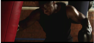
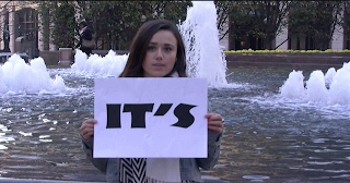
The music video, follows conventions by using close ups of the artist to establish the relationship with audience, as such establishes key star status of the artist. Our music video follows one of the three theories by Andrew Godwin. It follows the theory of illustration, as the lyrics suit the videos content, where the line says 'It's my time' there are people holding up boards that say 'It's my time'.
Rocky Running scene (Not the original)
We were inspired by the movie "Rocky". The running scene inspired us the most as when the runner in our video puts his hands up, likewise to Rocky, it symbolises that he has met his target and therefore he is ready and it's his time to achieve his dream.
Scorcher It's My Time
From this music video we got inspiration to use a crowd to be in the chorus likewise to the music video, as we felt this would be a great way to engage the audience and to give the music video a bit of humor. We also, decied to use the idea of people achieving, so we portrayed the story of a runner and a singer not to copy the video. However some of the shots gave us ideas to use an x-factor type style (with the judges) and likewise to the video.
Nick Jonas Who I am
As I have seen this music video many times before, I felt by using the idea of having cards to portray a story of the individuals would be more visually pleasing. By one side saying "Who I am" and the other saying what they have, i.e diabetes, I felt this would be a good way of illustrating to the audience their aspirations in life. By one side saying "It's My Time" and the other saying what they want to be in life, makes it easier for the audience to relate, as the people in the video may not look like what they want to be on the other side. I felt this was a good way to show the audience their ambitions and dreams and an effective use of props.
These are the stills from the videos above that influenced us;
Our representation and ideas from videos used in our music video;


No comments:
Post a Comment